


Well…well…well…check us out. After nearly 10 years of using the same daily email template we’ve made a few changes. What do ya reckon? I hope your computer didn’t catch on fire when it hit your inbox and you feel instantly calm with our minimal, zen like approach. In all seriousness…post a comment of your thoughts or problems.
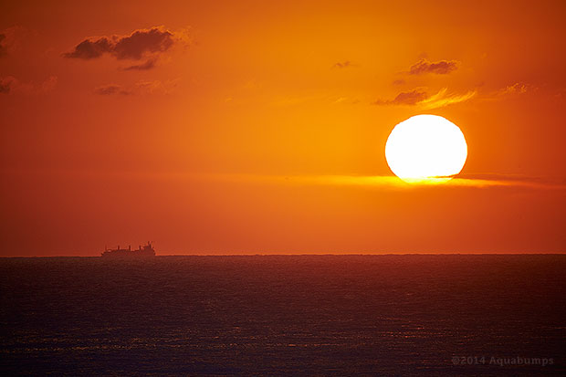
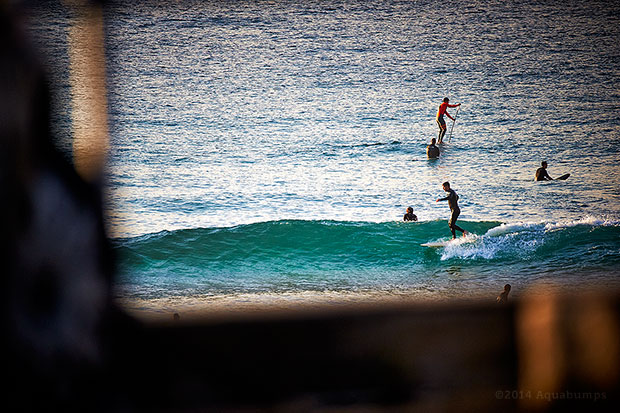
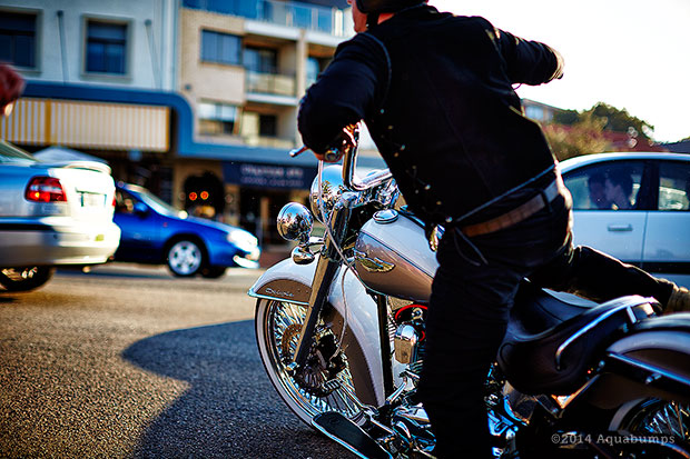
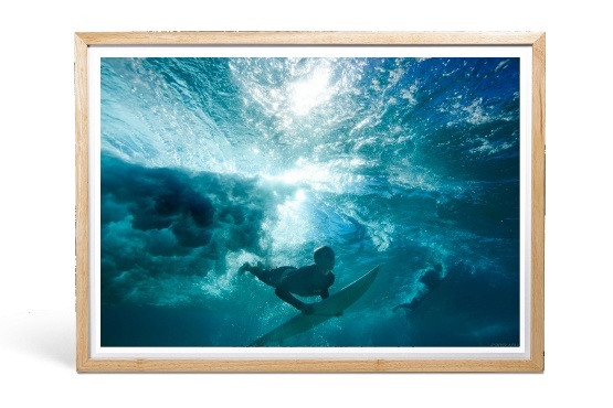
The beach today was full glam. 1 foot waves at Bondi and perfectly clear skies. She’s a bewty isn’t she?
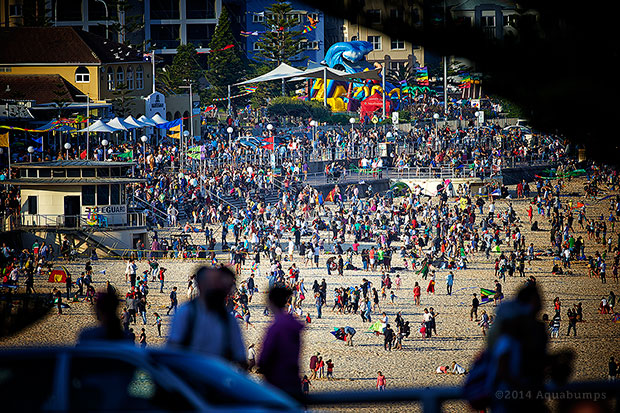
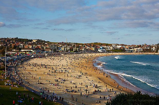
Yesterday was one of the busiest days I have ever seen down here. If I could explain what Manhattan NYC was like – it was Bondi yesterday. Every inch of road had a car, every piece of grass hosted a human. Here are previous years of the same day 2012, 2013, 2009
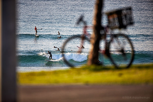
Swell coming…Wednesday should be fun!


I actually preferred the old email template! I was viewing it in Outlook 2010 and I think the previous template was actually the cleanest 🙂
Hi Team Aquabumps!
Great new newsletter but the images won’t load in my email- they always have before. now I ahve to click out of it into the browser. not sure why.. might be a glitch? if you can find away to fix that- that would be amazing 🙂
Thanks Justine, what are you using for email?
Its gmail though accessed through Apple Mail
I’m with Aaron. I think I preferred the old look. Maybe a mix of both would be good. I particularly preferred the round corners and the font in the old version (I’m not a fan of Times New Roman). Still, love your work and will tune in religiously every day!!
Yeah, I loved the rounded corners. It made them look like holiday slides. The font came through as Times New Roman for me too – I much preferred the older font. Also not sure about the style of the title and the inclusion of the “1…maybe 2 foot” heading.
Of course the photos are still fantastic Uge!
Love the new look Uge. Much cleaner.
Love the new template, love the pics, love the inspiration, love the surf and love the daily email. Keep ripping the waves Aquabumps!
A suggestion might be to remove the italics from the descriptions of each of the images – I think it would make the font seem a bit clearer and easier to read.
YOUR NEVER REGRET A SURF OR SWIM. Looking rather good from here. Well done. OLLY.
Love it. Nice to mix things up a bit. Simple format, clean and easy to read. : )
Using Outlook and font came through in Georgia 12pt (Serif), I think the old template looked a bit cleaner and less clunky, shots are great as always though!
New font is georgia Olly…and big…I like big type. Easier to read on all platforms.
it’s cos you’re getting old, Uge
Yes Steve, yes…I am old. Can I borrow your coke bottle glasses?
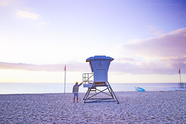
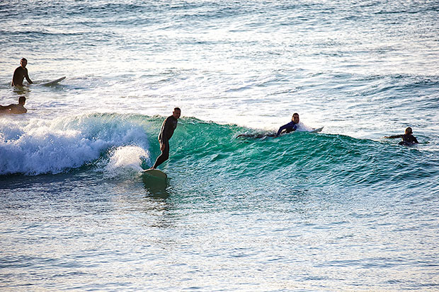
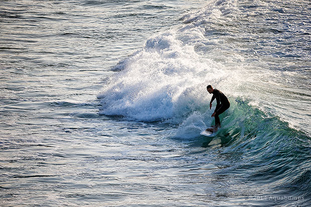
What a morning! Few fun ones out there when the swell came through.
Viewing in my feed in Outlook, the font could go a little smaller on the intro (looks fine when I open it as a new window though). Noticed the rounded edge gone on the images. Personally liked that feel, but can’t say a square edge is a deal breaker ha 🙂 Otherwise everything is viewing and functioning fine. Noticeboard is valuable to have in the feed. Might need to use that soon.
Cheers
Yeah Mayor! I dig it. Nice & clean on mobile (iphone) and like the little surf report one liner too, nice touch.
I feel the new template is a backward step:
The serif font gives off the impression – “I’m using default MS Office settings”
Similar for the square corners – “I composed this email on my iphone”
I love how the previous template uses the rounded corners & subtle drop shadow to leave me feeling “wow, there’s 10 pieces of art floating within this email I better look at them all”
H
whoops
that was meant to say
Hi Uge
I like the new look. The shots look like little windows in a wall of white to me.
same effect in the end.5 minutes of escapism
cheers
Geoff
Hey Uge…Is that your photo whacked onto a cool fridge on page 15 of today’s Financial Review??
Yep. that’s us.
New look is good – preferred the rounded corners and sans serif font (like the website) though
serif font can be really difficult for vision impaired desk monkeys, like me, who spend too long parked in front of their computer screens 🙂
The Chac,
Been doing rounded corners for 10 years…need something new and good clean square edges have taken my fancy.
Serif type is meant to be easier to read would you believe!
Thanks for the feedback, uge
Looking good! This new format loaded much more quickly for me. I always look forward to my daily escape email
Awesome, thanks for that Rach.
New a bit cleaner and as good as old, have only been a subscriber since a few weeks, hence the difference is not so “felt”. Keep ’em waves coming in any case. Michael from Dubai
Thanks Mike, yeah the changes are quite subtle.
Hi,
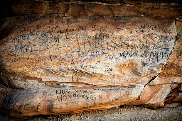
I realise you are only documenting, in images what you see, but I am horrified and disappointed to see the desecration of the beautiful natural patterns in the sandstone cave at Bronte.
By publicising the work of the mindless idiots who have graffitied the cave, I feel it will only encourage them.
Regards
Fran
Hi Fran,
The cave graffiti is written in charcoal, found in the cave.
So it just washes off with the next rain.
Thanks, uge
I really like the new look, not that I thought it didn’t look good with the previous look. I certainly like the new look better than the previous though.
Great stuff Uge!
Whatever the format the pictures remain amazing and brilliant and always remind me of the time I lived in Bondi.
I agree with Michael Coates but I preferred the sans serif in the copy. Unlike on paper I find sans serif fonts less tiring/easier to read on screen. It’s a nice and clean but also a bid more generic look i m h o.
Works on my phone now! My HTC wouldn’t resize to fit the email on screen, now it does – win 🙂
Yeah spent 4 weeks testing it on phones…
That is great news. Thanks, uge
Gotta say I prefer the san serif font. These eyes don’t find the serif font all that agreeable…now where did I put those goggles?
It’s all about the images…
Love. Receiving loud and clear on iPhone5s. Very clean and serene. Good choice. Keep em comin!
Overall nice, happy to lose the rounded corners, but prefer a sans saerif for body copy! Also not centred in my email client – Yahoo :-/
Hi Uge,
Definitely an improvement on the previous template. It feels much lighter and it’s easy to scan with the flat colour and removal of rounded corners and gradients. The larger serif type face is working much better also, it was really difficult to read at times especially on mobile in the previous design.
My only concern is the disconnect between the style used in the email template and the varying styles now displayed on the site. There needs to be more consistency here.
Cheers
Simon, it’s a work in progress.
The main website hasn’t been updated since 2005.
Working on that next – so don’t worry, it will all be in line.
Thanks for commenting, uge
new design is cool, captions a bit hard to read though, maybe another “old” thing – keep the changes coming Uge!
pictures have shrunk on the email when viewing on smartphone. I use S5, can’t really see content unless I double click on pics which I don’t really want to do….preferred the easy scroll down view and decent size. Looks ok on my iMac at home though, so maybe only a mobile device issue
Can never understand why people who’ve cracked a winning formula feel the need to change, when all they need to do is keep doing what they do. Preferred the old format Uge!
Don’t be scared of change Winston!
Love it!
Still doesn’t work in my email which is cool as work has it locked down pretty hard. In the browser all images worked except the one adjacent to the text which is blank with a red X. Hope this helps Uge. Feeling home sick every day I see your images but living in Sunny SoCal makes up for it! Keep up the awesome work!!
I take that all back, it just loaded up in my email for the first time, awesome!!!!
Loaded great in my iPhone 4s here in da USA.
dude this design is dope nice and clean cut. rounded edges are so 00´s. the future is square.